Modern Age
Aging Wellness Assessment
Helping patients take control of the aging process with data and personalized holistic care.

Summary
Project Details
My Role Design Lead
Team 1 Designer, 1 Product Manager and 6 engineers
Discovery and design 4 Weeks
Implementation 4 Weeks
Business Outcomes
-
Patients who had the assessment were 3X more likely to make a purchase than patients who only had a free consultation.
-
Became core product, creating 40% of company revenue
User Satisfaction Outcomes
-
Net Promoter Score of 9.5/10 .
The Story
Modern Age wanted to be the Amazon of Aging Wellness, but new users often found the company's offering overwhelming and didn't know where to start.
To guide users, the company offered free 30-minute in-person and virtual consultations with clinicians to discuss the patient's aging concerns to get them started with a treatment or product. It became a popular user journey entry point but was reducing the time clinicians could spend doing treatments or other paid services, and they needed to convert better to pay for the time lost.
To solve this business problem, our CEO wanted to create "paid" consultation program, where users paid a fee for lab work, and then clinicians could make recommendations based on cellular-level data to make them more personalized. Before we started investing resources into the experience, she wanted to know if there was a strong demand for it and how much people would pay, so she asked my product manager and me if we would do some research to gauge the market. We had three weeks to plan, do interviews, and synthesize the findings to meet a future launch deadline should strong demand exist.
How paid consults could solve business and user needs.

My first step was to interview our Chief Medical Officer to learn more about the science behind the program.
I also wanted to know how he would sell the service to a patient. The clinicians had already done one-off lab tests as a supplementary service when someone came in for specific prescriptions like hormone replacement therapy, so there was some qualitative data.
Key insights from my interview:
-
A blood test allowed him to see how a patient's systems interacted. For example, your energy level is a product of nutrients, brain function, and hormones. This test was about getting to the root cause to treat you properly.
-
He wanted to split the lab reports into five categories: general health, metabolic health, sex Hormones, thyroid function, and Inflammation.
-
The categories would group biomarkers, which were measurements like cholesterol level or estrogen levels, with a status label such as "maintain," "monitor," or "take action."
-
Since we can review many systems with this test, a patient wouldn't need to visit separate specialists, so convenience was a strong value proposition.

Example lab report a patient would receive.
Is this hard to understand? When I saw it I thought there was an oppurtunity to create value by making a patient's lab results less opaque and more insightful.
The Problem: How might we allow paid consultation patients to access their recommendations and lab reports so they can continue their aging wellness journey after their initial consultation?
I hypothesized that another cause of poor conversion was because patients did not receive a record of their discussion or recommendations after the free consult. The recommendations were delivered verbally, so after the chat ended, a patient was on their own to remember the recommendations and find them on the site. I started thinking about ways to deliver a patients lab reports and provide them with a record of their consult within there account, so it would always be there to refer back to as they continued their aging wellness journey. I thought having both the recommendations and lab reports together in an insights center in the patients account could connect the two, with a more understandable lab report improving the credibility of the recommendations.
Paid Consultation Lab Report Potential Solutions

Creating a plan to test demand for the service, and the impact of the digital product.
What we want to know:
-
In terms of aging, what are common problems and goals users have?
-
Do users think the lab results and the recommendations are worth $500?
-
What are the most valuable benefits to the user- why would they purchase this?
How we would discover it:
-
Show a landing page concept without the price to see if they would be interested in purchasing and, at what price, and what they saw as the main selling point.
-
Show them a digital lab report concept to see if the product was valuable and get usability feedback I could use for the next design phase.
User Demographics:
-
Men and Women
-
Age 35-55
-
Average income of 150k+
-
Interested in improving how they age
-
Sourced from Userinterviews.com
The first step in designing the assets for the interviews was to determine the information architecture of the lab results.
The reports exist as a page in a users account called "Aging Wellness Insights" and are split up between the clinician's summary, and the biomarker results.

As I worked on the visual design for the labs, a core goal of mine was to ensure the results were easy to understand and did not induce anxiety around problematic results.
I also wanted to make the summary and report feel personalized, like a letter from a clinician. Unlike typical lab reports, it should be easy to understand and not overwhelm users with data. I wanted the colors attributed to calming. Last, text must be ADA-compliant since our customers will likely be older.

Clincian Summary
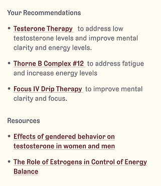
The clinician's overall summary of their results features an image of the clinician and is in a letter format to make it feel personal.The links to the recommendations are written in prose rather than bullets at the end to make them feel less sales-y.

Biomarkers
The prototype needed to include a visualization of the lab results for each of the 5 categories.
Each category featured insights about the results- what clinician's found and actions they suggest the user take to improve any health issues.
The interviews proved a strong demand- 7/10 users said they would purchase for $500, but 3 only said yes after they interacted with the prototype of the insights center.
Key Insights:
The core value was the lab report due to the amount of information about how each of the biomarkers affected their health and deeper insights than they usually receive.
Everyone ages differently, so it was important for patients to know how their results compared to their peers, not just a general "good or bad."
The lab report substantiated the recommendations which felt personal due to the in-depth clinician summary, not a 5 minute phone call.
We reported back to our CEO, who was convinced and wanted to create a more comprehensive program aligned with the company's holistic approach to aging.
In addition to the biomarkers, she wanted to include a patient's Subjective Age Assessment and Cognitive Function Test results to allow clinicians to have additional diagnostics to create a more thorough aging wellness plan. Subjective Age is a free assessment that takes a photo of you and calculates how old you look. The cognitive test was a series of 3rd party mini-games that users took on another website to see how their brain function compared to others in their age group.
The Paid Consultation Process

Our CEO wanted to increase the biomarkers from to 20 to 55, which would break the current information architecture.
Since users were paying for 55 biomarkers, our CEO thought we should show all of them, not just the ones clinicians would focus on. This would break the current IA, so I spoke to our clinicians, and we decided to create sub-categories for biomarkers and give a rating for each one (Take Action, Maintain, or Monitor).
The New Account Information Architecture
The new IA would have to accommodate many layers since the insights center was already in a user's account rather than its own page.

I started exploring more scalable frameworks for the results that would work for the new information architecture.
Since 80% of our traffic came from mobile, I worked on the mobile design first. I started the design process by working on the outermost layer, and working down. In order for the design to be more scalable, I proposed option C since it having the assessesment on it's own page allowed for more levels of content on the same screen.
Concept A
Long scrolling page with cards for each category that user can open to view all biomarkers

Concept B
A single nested accordion with the summary, categories, and biomarkers on the same page.

Concept C
Each category has it's own page, with biomarkers in their own accordion.

I also explored several biomarker designs, considering which would be easiest to scan and minimize scroll depth.
One user interviewee thought of his health like a credit score since things you do now affect how you age later. I experimented with this but ultimately decided many people need a positive association with credit scores.
Concept A
Similar to a credit score

Concept B
Focuses on the value, not the range

Concept C
Easiest to scan and process
I started my first round of user testing with concept C because it minimized scroll depth and let users focus on one category at a time.
Concept C gave the assessment its own page rather than a tab within the account, which would let me add a navigation layer between the summary and test results and the biomarkers below. It also made it feel like an actual "product" rather than just a page in your account.
One of the key things I wanted to focus on in my user testing was the navigation around the results and biomarkers. Since a big part of the value proposition was the comprehensiveness of the assessment, I wanted to make sure users knew how to see all of their results and dig deeper to gain more insights.
Other Design Changes
-
On the results tab, I simplified the overall design to let the visualization of the test results stand out more since that impressed people so much during our interviews.
-
Since the concept of "positive" and "negative" is associated with the results of blood tests, I didn't want to use + and - for controls, as they could be mistaken for test results.
-
To improve legibility, I didn't use a card design to widen the long-form text areas and improve legibillity.
Summary Tab
Results Tab
Results Biomarker Open

The clinician's overall interpretation of your lab results
Links to Modern Age products and treatments

Biomarker category selector
Biomarker category result discoveries
Sub-categories have a overall rating so users scan and dive deeper into results

Biomarker sub-category open with education about why they matter
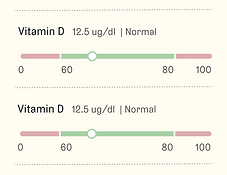
Visualization of your results with non-anxiety inducing colors
In user testing, users had difficulty finding the category dropdown and needed a key to interpret the biomarker results and a more obvious design for product links.
I tested the design with ten users on usertesting.com. Overall, most users found the results to be intuitive and very in-depth. There was a lot of content, but they felt it was necessary but manageable. The design of the biomarkers did not create anxiety, even if the results were out of range and users saw the sub-category accordions. However, users did not see the dropdown that housed the categories, so they thought there was only one.
User Testing Problem A
Users missed the category dropdown, so weren't aware there were other categories

Solution
In order to save time, I used our standard dropdown, which was much more visible

User Testing Problem B
Color coding of results wasn't clear unless a biomarker showed all 3 ratings

Solution
I added a key with some text explaining how to interpret the ratings

User Testing Problem C
Users didn't know if the links were to PDP's or outside articles because they were mixed together.

Solution
Separate products and treatments at the end of the summary with copy to explain relevancy of each.
With another round of testing, the design changes proved successful so it was time to hand off to developers.
Because of our tight deadline, I was testing until the last minute before creating specs for implementation. Luckily, all the users I tested found everything intuitive and were impressed with the product, with several saying they would purchase it for $500 and wanted to be notified of the launch!
The final design for implementation
Since 80% of our users were mobile users, I optimized the design for mobile, and kept the single- column layout on desktop and tablet to limit complexity for our engineers and to make the launch deadline.
Clinician's Summary

Results for Biomarkers

Results for Cognitive Test
Tablet & Desktop
